John Virtue (Paintings) British, b. 1947
-
Overview
 Virtue's blacks and whites aren't polarised absolutes: they drip and smear each other with gleeful impurity, much of the white flecked with a kind of metropolitan ashiness that gives the paint guts and substance, much of the black, streaky and loose, like road tar that refuses to set.
Simon SharmaJOHN IS AN MA GRADUATE OF THE SLADE SCHOOL OF ART
Now in his seventies, John Virtue is considered one of the most distinguished painters working in the United Kingdom today. His work is included in the collections of TATE, London, Walker Art Center, Minneapolis, Yale Center for British Art, New Haven, British Museum, Victoria and Albert Museum, Government Art Collection (UK), Arts Council of England and The Courtauld Institute. He is a painter whose work rides a fine line between figuration and abstraction.
For the last fifty years, Lancashire, the Exe estuary in Devon, London, the Italian landscape and the North Norfolk coast have been the subject of intense ritualistic scrutiny, always rendered in black and white.
In 2003, he became the sixth associate artist at The National Gallery, London, a scheme that allowed an invited contemporary artist to connect with the collection to produce work inspired by the Old Master tradition. Culminating in 2005, a group of monumental London skyline paintings were exhibited at this flagship public institution.In 2009, John moved from Italy to North Norfolk, where he wrestled with the enormity of the sea, sky, and weather around Cley-next-the-Sea and Blakeney Point. Since 2020, he has worked from a studio in Hertfordshire.
His work has been deeply influenced by giants of the past, such as John Constable, Samuel Palmer, and J M W Turner, as well as twentieth-century greats Franz Kline, Robert Ryman and Jackson Pollock. Japanese calligraphy has also left a profound mark on his painting, a testament to his admiration of Ike no Taiga (Edo period) and Sengai Gibon (Rinzai School).
In 2019, a monograph covering over forty years of John's work was published by ALBION Ridinghouse. This two-hundred-and-eighty-five-page illustrated book provides a substantial overview of the development of Virtue's art. It traces his close relationship with locations in Devon, Exeter, London, Italy and Norfolk. The critical text is provided by Paul Moorhouse, Ex TATE and previously, Senior Curator, 20th Century Collections, National Portrait Gallery.
The gallery has work from all periods of the artist's oeuvre. If you are thinking of buying or selling, please get in touch.
Please email the gallery for information about works currently for sale. -
Current Works (2025)
-
John Virtue (Paintings), Untitled, 2025
-
John Virtue (Paintings), Untitled, 2025
-
John Virtue (Paintings), Untitled, 2025
-
John Virtue (Paintings), Untitled, 2025
-
John Virtue (Paintings), Untitled, 2025
-
John Virtue (Paintings), Untitled, 2025
-
John Virtue (Paintings), Untitled, 2025
-
John Virtue (Paintings), Untitled, 2025
-
John Virtue (Paintings), Untitled, 2025
-
John Virtue (Paintings), Untitled, 2025
-
John Virtue (Paintings), Untitled, 2025
-
John Virtue (Paintings), Untitled, 2025
-
John Virtue (Paintings), Untitled, 2025
-
John Virtue (Paintings), Untitled, 2025
-
John Virtue (Paintings), Untitled, 2025
-
-
Matt Lippiat in conversation with John Virtue (2025)
This is an edited transcript of a conversation with artist John Virtue recorded on the 30th of Sept 2025 at his studio in Hertfordshire, England. Born in 1947, Virtue studied painting in the 1960s at the Slade School of Art, where he formed lifelong friendships with fellow painters Frank Auerbach and Euan Uglow. In the late 1970s, the core traits of Virtue’s mature practice emerged; ever since, he has worked exclusively in black and white, taking as his subject matter the experience of daily walks along fixed routes local to wherever he is living at the time. Working within those parameters, Virtue’s painting has continuously evolved, synthesising diverse influences, from Asian calligraphy and American Abstract Expressionism to Western landscape painting. At the time of writing, Virtue’s Landscape No.109 (1990-91) hangs in the Tate Britain gallery in a display with paintings by Constable and Turner - two artists that Virtue has a lifelong interest in.
In 2019, writer Paul Moorhouse published a monograph on Virtue, charting the preceding fifty years of Virtue’s painting practice up to that point. Moorhouse begins with the tessellated grids of observational drawings that Virtue first exhibited in the late 1970s, and ends with a reproduction of a 6-metre wide painting titled THREE, completed by Virtue in 2019. In the six years since then, Virtue’s physical mobility has become more limited. However, he continues to work with undiminished dedication and has developed a large and surprising new body of work.
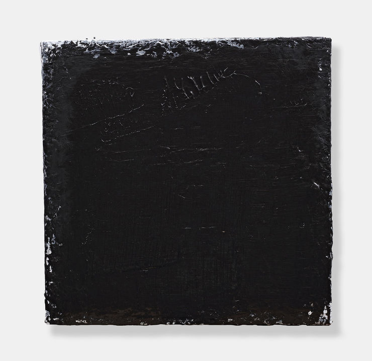
On the day this conversation was recorded, Virtue’s studio is filled with these new paintings. Almost every available surface within reach is busy with canvases in an extraordinary variety of dimensions. Each canvas is covered in black paint with built-up impasto texture and a high sheen, reflecting light dynamically across the surface as the viewer moves in front of the painting. On a table, numerous sketchbooks sit in rows beside a ready supply of extra-large black oil pastels, and on the floor, large sheets of paper are arranged in a grid, calling back to the grid structure of Virtue’s earliest exhibited works - a format he hasn’t returned to in almost 35 years, until now. Like the paintings on the walls, these works on paper are also covered in thickly accumulated layers of paint, reflecting the light like a carpet of black leather.
In the past, Virtue’s paintings have been discussed primarily in terms of a negotiation between two related categories of art: abstraction and landscape painting. However, surrounded by this new work, neither John nor I mentioned the subject of landscape. Instead, I suggested affinities with modernist monochrome painting and Minimalist sculpture, while John framed the discussion, perhaps surprisingly, within a much older history of mostly figurative painting.
On reflection, the way that landscape imagery has receded from Virtue’s latest paintings might be interpreted as a reflection of his reduced mobility, which prevents him from taking the long daily walks that were so central to his earlier work. However, that didn’t occur to me during our conversation, perhaps because the new work didn’t seem to invite a looking back to what had gone before, but rather, focused our attention on the immediate present, and to what liesahead.
ML: There are a lot of paintings here. Which is the most recent, and which is the oldest?JV: It’s continuous, I’m working across all of them, and I go in a rhythm. There are ninety of these tiny things, so I work through from one to ninety. Then the medium and bigger ones. I don’t have the physical strength to make the giant paintings I made before. I’ll be 79 next year, maybe I can get on a bit further. I hope I can go on doing them, because it’s been incredible. It’s such a thrill to wake up in the morning. I still have a set routine: I’m in here before 8 am to review the work, I open the studio, and I really try physically to push myself.
ML: The studio feels very active. The way you’ve hung these everywhere, it’s like a Salon hang.
JV: It is, yes, but this isn’t a salon. They’re hung this way for my benefit, the rhythms, it’s all helping me. You’re the first person to see these other than a few people close to me. Nobody else comes. That’s been true of my practice all the way through my life.
ML: With the works on paper on the floor, and the way the paintings are hung, it’s also like a sculptural installation. Each painting could be seen as a sculptural unit. Some of the small ones look almost as deep as they are wide.
JV: You notice they’re all the same depth. I’ve tried them on thinner stretchers, and it doesn’t work.
ML: And the smallest ones are 45 millimetre square cubes?
JV: Exactly. They’re all on Belgian linen, and the linen was showing at the sides. I decided that was a distraction, so I painted black all the way around the edges.
ML: Paying attention to the edges of the support seems like a sculptural approach. Do you still see these primarily as paintings?
JV: At the beginning of my career, when I had to be a postman, working on a tiny table, in a tiny weaver’s cottage in north east Lancashire, I told people “I’m painting”, but I was using pencils, graphite sticks, then mapping pens and dipper pens, and black ink with shellac. It’s the same ambition now: they’re paintings, but they’re not paintings. How do you describe what you’re doing? I’ve no idea. All my life, I’ve seen painting as a paradox and a contradiction.
ML: They make sense as a continuation of your painting practice, but there’s also an affinity with Minimalist sculpture, like Donald Judd, or in painting, Robert Ryman. Maybe I’m thinking of Minimalist series because, the way they’re hung, it’s difficult not to read them as a group. Are you still thinking of them as individual paintings?
JV: Yes, they’re individual works at the moment. Lately, I’m excited about these long, thin panels. They go up to seven feet tall. I had such trouble with them, how to hang them, and then I found that they work best hanging in very thin spaces.
ML: What about the square ones? Do they have a fixed orientation, or could you turn them ninety degrees?
JV: I do that all the time. There’s no top or bottom, no left or right.
ML: The surfaces are so glossy, they look wet.
JV: Yes, but they’re dry, you can touch them. I don’t always use brushes, but when I do, I use 6 and 8 inch brushes. I also use J-cloths to paint with. These are painted again and again and again.
ML: Is the paint acrylic or oil?
JV: The only paint I use is heavy bodied carbon black Golden acrylic paint in gallon tubs. I've used acrylic for over twenty years. I used carbon black and titanium white, but this year I stopped using the titanium white. You’ll see vestiges of it on these, but only pared right back to the edges. I’ve also been making these.
[John gestures to a large number of sketchbooks, seemingly filled with page after page
of heavily built up black oil pastel. He invites me to have a go, using a giant oil pastel to
add to an already heavily worked page of oily blackness.]
JV: Press hard with the oil pastel. It builds a texture. You build on it and build on it and build on it.
ML: Why did you switch to using only the colour black?
JV: In my work, I have never seen black as a colour, or a non-colour; I see it as a medium for expression. It’s very early days to be talking about these paintings. I’ve come to this way of working after nearly fifty years. Now I’m staggering about like an old man, but the last time I was able to travel was 2019. I was in Spain looking at Picasso, El Greco, Zurbarán, Goya. When I
look at Goya, what am I looking at? Black. In the Toledo cathedral, Goya’s The Taking of Christ, it’s ten feet by seven feet, the white gown against all the black, it’s like an inverted scimitar. In abstract terms, it’s sensational. In the El Greco museum are El Greco’s apostles; they’re all approximately 100x120 cm rectangles, but brilliantly suggestive for me, when thinking about my black squares. But I’m nervous about people seeing these. I don’t know what anyone will think of them. Probably meaninglessness.
ML: I suppose those criticisms have always been levelled at modernist reduction, monochrome painting, Minimalism, that whole tradition. Especially when the colour is reduced to just black, or just white.
JV: I went on a scholarship to America in 1965 as a 17-18 year old. I went into the Met and saw a giant early flag by Jasper Johns. The whole thing’s white, an assembly of canvases, so the stars are individual canvases slotted into the big canvas, and the stripes are made of canvas slotted in also. I went to MOMA and there was a recent acquisition by Ad Reinhardt. This is a 5ft square black painting made of nine different blacks. I’d never seen anything like it. I thought it was so inventive.
But this work I’m doing now has nothing to do with Ad Reinhardt. This has nothing to do with Malevich. This has nothing to do with Franz Kline, although I think all these artists are terrific. However, to me, my work has a lot to do with Goya, and, for example, Rembrandt’s late work. That’s what I look at. El Greco was not rated at all after his death, and then in 1904, around about the beginning of the last century, he reappeared again as a great Spanish artist. Before that, he was under the rubble, so to speak. I quite like the idea of being under the rubble. Still, the more I say these things to you, the more I think how utterly pretentious.
ML: Pretentious how?
JV: Because I believe there is something in it, relating to these recent paintings I’ve been working on. One or two of them, the tiny two inch ones, one or two of the heavy paper ones, that big seven foot work, in them, I believe, there is a truth. What on earth do I mean? What do I mean by truth? I mean a feeling, where you have a totally empathetic mute response to the
work, instead of hostility and negativity acting as a barrier, as a rhetorical response.
ML: Does it take time to recognise? Do you have to live with them for a while, to know if they’re doing what you want?
JV: Yes, I’m not letting much of this out of the studio yet. I’m keeping them in here. I feel this’ll be it. The black, it’s not about depression, but an exhilarating finale.
ML: But you’re still enjoying painting.
JV: Certainly. If you go on a long time doing it, and you decrease in physical ability, the mental ferocity of the pursuit must increase. Look at those films of Henri Matisse, when he was dying. He’s in his bed, cutting the paper and using a big stick to point with, and there’s a young assistant pinning the paper in place. Those works, they’re terrific. The drive is still there. It’s a
visceral compulsion, like an addiction. I’m totally addicted to this.
-
Works (1990-2023)
-
John Virtue (Paintings), Untitled No.15, 2020-23
-
John Virtue (Paintings), Untitled No.38 (Diptych), 2020-22
-
John Virtue (Paintings), Untitled No.39 (Diptych), 2020-22
-
John Virtue (Paintings), Untitled No.61, 2019-20
-
John Virtue (Paintings), Untitled No.64, 2019-20
-
John Virtue (Paintings), Untitled No.74, 2019-20
-
John Virtue (Paintings), Untitled No.77, 2019-20
-
John Virtue (Paintings), Untitled No.2, 2018
-
John Virtue (Paintings), Untitled No.26, 2017
-
John Virtue (Paintings), Untitled No.27, 2017
-
John Virtue (Paintings), Untitled No.21, 2017
-
John Virtue (Paintings), Norfolk No.1, 2011-13
-
John Virtue (Paintings), Norfolk No.3, 2011-13
-
John Virtue (Paintings), Italy No. 13, 2008
-
John Virtue (Paintings), Italy No.8, 2008
-
-
John Virtue by Paul Moorhouse
Art historian and curator. From 2005-17, Senior Curator of Twentieth-Century Collections and Head of Displays (Victorian to Contemporary) at the National Portrait Gallery, London.
John Virtue by Paul Moorhouse, a monograph covering over forty years of John's work, was published in 2019 by ALBION Ridinghouse. Paul Moorhouse has been closely associated with the artist for over twenty years and has written extensively on his work. In this lavishly illustrated book, he discusses the development of Virtue's art from its beginnings and traces the artist's close relationship with locations in Lancashire, Devon, Exeter, London, Italy and Norfolk. As Moorhouse shows, these places have each generated a fresh artistic response, forming distinct episodes in an overarching vision. This is rooted in the landscapes that Virtue observes but also in deeper aspects of experience. For in Virtue's art, the passage of time, mortality, and a will to express the intensity of each lived moment are abiding themes.
In 1978 John Virtue had been living in Green Haworth, a remote Lancashire village, for seven years. During that time, he had struggled to find a way forward as an artist and had become discouraged by a growing sense of failure. Finally, he decided to destroy all his previous work. This destruction was to prove a liberation. In April that year, he resolved to 'try and become a real artist'. It was a memorable turning point. He decided that the surrounding landscape would form his subject and that in his response to it, there would be no equivocation. Eliminating brushes, colour, paint and canvas - all of which seemed extraneous to the direct means of expression he was seeking - he began again by making small pencil or charcoal drawings during regular walks. These images, he decided, would unfold like a visual diary. With this pledge, Virtue determined the course of his art. It commenced a journey that continues to the present day.
During the ensuing four decades, Virtue has forged a distinctive artistic path. Drawings made in the landscape have continued to be the primary source for larger works created in the studio. There, the images preserving his original experiences yield a second phase of imaginative and expressive engagement that goes far beyond each observed motif. Combining walking, drawing, abstraction and radical improvisation, Virtue's dynamic process has produced a body of work that extends the tradition of landscape painting in unprecedented ways. Today, Virtue is widely regarded as one of Britain's leading painters. -
-
-
-
Video
-
The Glance and the Gaze
John speaks about his work at a TED x Courtauld Institute Event, 2018 -
John Virtue and the Sea
2015 Solo exhibition at the Towner Art Gallery, Eastbourne -
Towner Art Gallery Discussion
John Virtue and Andrew Graham Dixon in conversation at the Towner Art Gallery, Eastbourne during Virtue's 2015 exhibition, John Virtue : The Sea. Andrew Graham Dixon is an award-winning art... -
The Culture Show
A PORTRAIT OF JOHN VIRTUE PRIOR TO HIS EXHIBITION, 'LONDON PAINTINGS', AT THE NATIONAL GALLERY, LONDON produced by BBC TELEVISION 2005
-
-
-